 Often when starting up a business, many entrepreneurs are too caught up in creating their business plan, hiring staff, and making sure daily operations are accounted for to properly brand their new business. When starting up a business, you need to design a logo, choose a color or two, and pick an appealing font. It’s that easy, right?
Wrong…As a matter of fact, you’re very wrong.
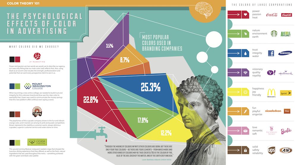
The color you choose for your brand speaks 1,000 words to how your customers relate to your brand. A green logo can be soothing and mentally relaxing for some people, offering a sense of serenity. If you’re a massage parlor or a hotel, this sense of calming can alleviate stress even before your guests step in the door. If you own a gym, a red branding image can instill excitement, increase enthusiasm, and encourage action! We can look examples like Lowe’s, a store branded as trustworthy, dependable and strong with their deep blue logo. Compared to their direct competitor, Home Depot, who instills friendliness and confidence with their orange theme.
Another key to the branding game is making your brand easily recognizable. Consider your own reaction when you see yellow and red together. What instantly came to mind? I have a feeling it might have you craving a Big Mac.
It’s important to remember that every person interprets colors a little bit different, and these feelings toward colors can differentiate person to person. When it comes to branding, it’s all about portraying your story, vision, and mood your brand is all about!
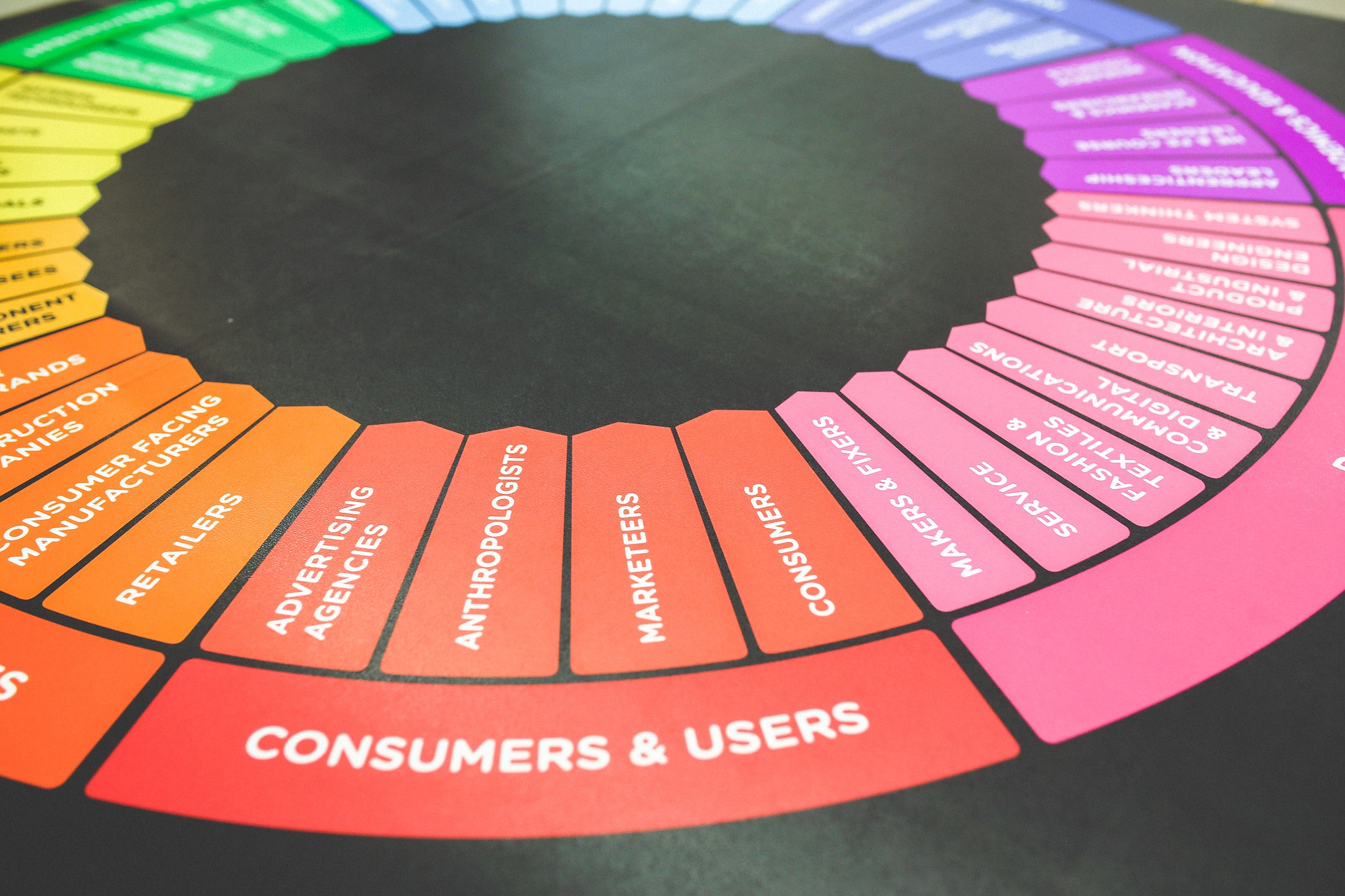
(Image Courtesy of: JPMKTG)